


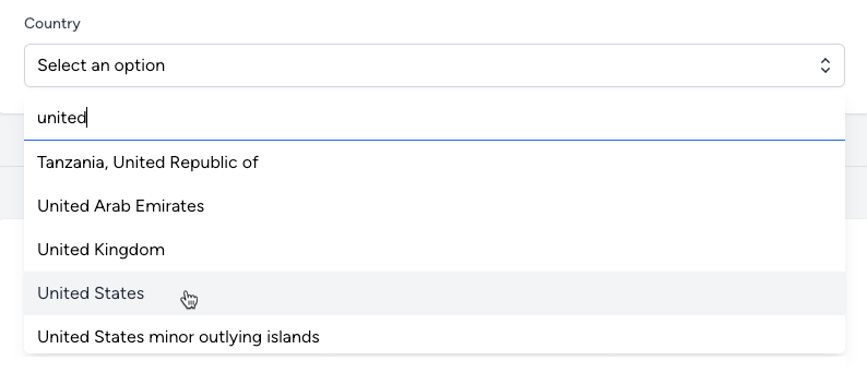
When designing web applications, creating components that improve user experience while maintaining efficiency and elegance in code can be quite challenging. This tutorial explores how to construct a searchable select box component utilizing Livewire 3, Alpine JS, and TailwindCSS. This component enhances form interactions by allowing users to search and select from a list of options dynamically. Completed code at the end of the article!
Core Technologies Overview
Livewire 3: A modern full-stack framework that integrates seamlessly with Laravel, enabling the developer to build dynamic interfaces efficiently.
Alpine JS: A lightweight JavaScript framework for adding interactivity to web pages, following a declarative approach.
TailwindCSS: A utility-first CSS framework for rapidly building custom designs.
Understanding the Code
The given code snippet outlines a Livewire component designed to render a searchable select box. Let's break down the key parts:
@props(['options', 'property'])
@props declares the component's expected properties: options (the list of selectable options) and property (a binding property name that Livewire uses to store the selected option's value).
Alpine JS Initialization
We then initialize our Alpine JS component within a div, specifying its structure and behavior:
<div x-data="{
        open: false,
        search: '',
        selectedId: @entangle($property).live,
        options: @js($options),
        get filteredOptions() {
            if (!this.search.trim()) return this.options;
            return this.options.filter(option => option.name.toLowerCase().includes(this.search.toLowerCase()));
        },
        get selectedOption() {
            if (!this.selectedId) return null;
            return this.options.find(option => option.id === this.selectedId);
        },
        selectOption(option) {
            this.selectedId = option.id; // This should now properly update Livewire's `selectedId`
            this.open = false;
        }
    }"
>
Inside x-data, we define:
open: Controls the visibility of the dropdown menu.search: Stores the current search input to filter options.selectedId: Uses Livewire's@entangleto sync with a Livewire property, allowing for reactive data binding.options: Injects the Blade component'soptionsinto JavaScript.filteredOptions(): A computed property that filters options based on the search input.selectedOption(): Determines the currently selected option.selectOption(option): Updates the selected option and closes the dropdown menu.
Component Markup
The component's markup includes a button to toggle the dropdown and a div that appears when open is true, containing a search input and a list of options:
<div class="relative mt-2">
    <button @click="open = !open" type="button" class="...">...</button>
    <div x-show="open" @click.away="open = false" x-cloak class="...">...</div>
</div>
The button displays the selected option's name or a default prompt.
The dropdown (
x-show="open") contains an input bound withx-model="search"for filtering options, and atemplatetag that iterates overfilteredOptionsto display each option.
In the searchable select box component, this section of the markup plays a crucial role in presenting the dropdown menu where users can search and select from the filtered options. Let's break down its functionalities and design aspects:
<div x-show="open" @click.away="open = false" x-cloak class="absolute z-50 mt-1 max-h-60 w-full overflow-auto rounded-md bg-white py-1 text-base shadow-lg">
    <input type="text" x-model="search" placeholder="Search..." class="block w-full border-0 border-b border-gray-300 bg-white pb-2 pl-3 text-left focus:ring-0">
    <ul class="max-h-60 overflow-auto">
        <template x-for="option in filteredOptions" :key="option.id">
            <li @click="selectOption(option)" class="cursor-pointer select-none py-2 pl-3 pr-9 hover:bg-gray-100 hover:text-gray-800" :class="{'bg-sky-600 text-white': selectedOption && selectedOption.id === option.id}">
                <span x-text="option.name" class="font-normal block truncate"></span>
            </li>
        </template>
    </ul>
</div>
Dropdown Container
x-show="open": This Alpine.js directive controls the visibility of the dropdown based on theopenproperty. The dropdown is shown only whenopenistrue.@click.away="open = false": This directive hides the dropdown when a click occurs outside of its boundaries, enhancing the user experience by allowing easy closure of the component.x-cloak: This attribute ensures the dropdown remains hidden during page load, preventing any flickering or unwanted visibility before Alpine.js initializes.The
classattributes apply TailwindCSS styles, setting the dropdown's position, z-index, margin, maximum height, width, overflow behavior, border radius, background color, padding, text size, and shadow to create a visually appealing and functional dropdown.
Search Input
The input element is bound to the
searchproperty usingx-model="search", allowing real-time filtering of options as the user types.Placeholder text guides the user on the input's purpose.
TailwindCSS classes style the input, ensuring it matches the overall design of the dropdown, including width, border, padding, and text alignment settings.
Options List
A
ulelement contains a list of options, styled for scrolling and appearance.template x-for="option in filteredOptions": This Alpine.js directive loops overfilteredOptions, rendering anlielement for each option.filteredOptionsis a computed property that returns options matching the search input.Each
lielement is clickable, with@click="selectOption(option)"updating the selected option and closing the dropdown. This interactivity is made possible by Alpine.js.Conditional classes (
:class="{'bg-sky-600 text-white': selectedOption &&selectedOption.id===option.id}") highlight the currently selected option, improving user feedback.x-text="option.name"dynamically inserts the option name into each list item.
This part of the component is pivotal for its functionality, providing users with a responsive and interactive interface for selecting options from a potentially large set, enhancing forms, and other input fields with a clean, user-friendly selection tool.
Styling with TailwindCSS
TailwindCSS is used extensively for styling the component, making it visually appealing and consistent with the application's design system. The classes applied handle aspects like positioning, padding, text styling, background colors, and responsiveness.
Usage Example
To use the searchable select box in your application, include the component in a Blade file with the necessary options and property attributes. Here's a basic example:
<x-searchable-dropdown :options="$options" property="property_name" />
$optionsshould be an array of objects, each containingidandnameproperties.property_nameis the name of the Livewire property that will store the selected option'sid.
Conclusion
By leveraging the combined power of Livewire 3, Alpine JS, and TailwindCSS, we've created a dynamic and interactive searchable select box component. This component not only enhances user experience by making it easier to find and select options from a potentially long list but also exemplifies modern web development practices—keeping the interface responsive, the codebase clean, and the development process efficient.
Final Code
@props(['options', 'property'])
<div x-data="{
        open: false,
        search: '',
        selectedId: @entangle($property).live,
        options: @js($options),
        get filteredOptions() {
            if (!this.search.trim()) return this.options;
            return this.options.filter(option => option.name.toLowerCase().includes(this.search.toLowerCase()));
        },
        get selectedOption() {
            if (!this.selectedId) return null;
            return this.options.find(option => option.id === this.selectedId);
        },
        selectOption(option) {
            this.selectedId = option.id; // This should now properly update Livewire's `selectedId`
            this.open = false;
        }
    }"
>
    <div  class="relative mt-2">
        <button @click="open = !open" type="button" class="relative cursor-pointer w-full text-normal border-gray-300 rounded-md bg-white py-2 pl-3 pr-10 text-left shadow-sm ring-1 ring-inset ring-gray-300  focus:border-sky-500 focus:ring-sky-500">
            <span class="block truncate" x-text="selectedOption ? selectedOption.name : 'Select an option'"></span>
            <span class="pointer-events-none absolute inset-y-0 right-0 flex items-center pr-2">
                <svg class="h-5 w-5 text-gray-800" viewBox="0 0 20 20" fill="currentColor" aria-hidden="true">
                    <path fill-rule="evenodd" d="M10 3a.75.75 0 01.55.24l3.25 3.5a.75.75 0 11-1.1 1.02L10 4.852 7.3 7.76a.75.75 0 01-1.1-1.02l3.25-3.5A.75.75 0 0110 3zm-3.76 9.2a.75.75 0 011.06.04l2.7 2.908 2.7-2.908a.75.75 0 111.1 1.02l-3.25 3.5a.75.75 0 01-1.1 0l-3.25-3.5a.75.75 0 01.04-1.06z" clip-rule="evenodd" />
                </svg>
            </span>
        </button>

        <div x-show="open" @click.away="open = false" x-cloak class="absolute z-50 mt-1 max-h-60 w-full overflow-auto rounded-md bg-white py-1 text-base shadow-lg">
            <input type="text" x-model="search" placeholder="Search..." class="block w-full border-0 border-b border-gray-300 bg-white pb-2 pl-3 text-left focus:ring-0">
            <ul class="max-h-60 overflow-auto">
                <template x-for="option in filteredOptions" :key="option.id">
                    <li @click="selectOption(option)" class="cursor-pointer select-none py-2 pl-3 pr-9 hover:bg-gray-100 hover:text-gray-800" :class="{'bg-sky-600 text-white': selectedOption && selectedOption.id === option.id}">
                        <span x-text="option.name" class="font-normal block truncate"></span>
                    </li>
                </template>
            </ul>
        </div>
    </div>
</div>